Who’s Playing and What’s the Score?
Like every designer, I fixate on things. Little bugs and annoyances, or information presented poorly.
Many score bugs don’t work very well. They’re visually awkward.
Here is an example from a NBA game on Amazon Prime.
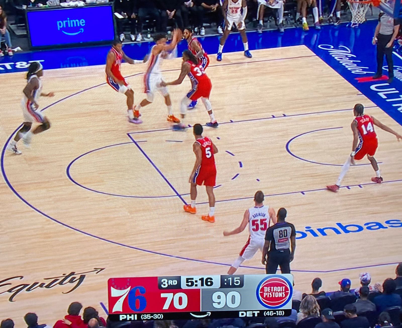
The primary function of this graphic is to show the score, which includes identifying the teams.
In the image above, it’s immediately clear the score is 70 to 90. But it takes a moment to figure out that it’s the Philadelphia 76ers who are losing to the Detroit Pistons. The logos are doing a lot of work and the 76ers logo doesn’t read well in this context. Plus the team abbreviations are too small.
But my main gripe is with an important secondary goal of the graphic. It needs to communicate the colors each team is wearing. This graphic get it half right. The 76ers are in red, and red fills their half of the graphic. But the Pistons are in white, which gets translated into an ugly gray blend in the graphic. Boo.
There is a better way to communicate this.
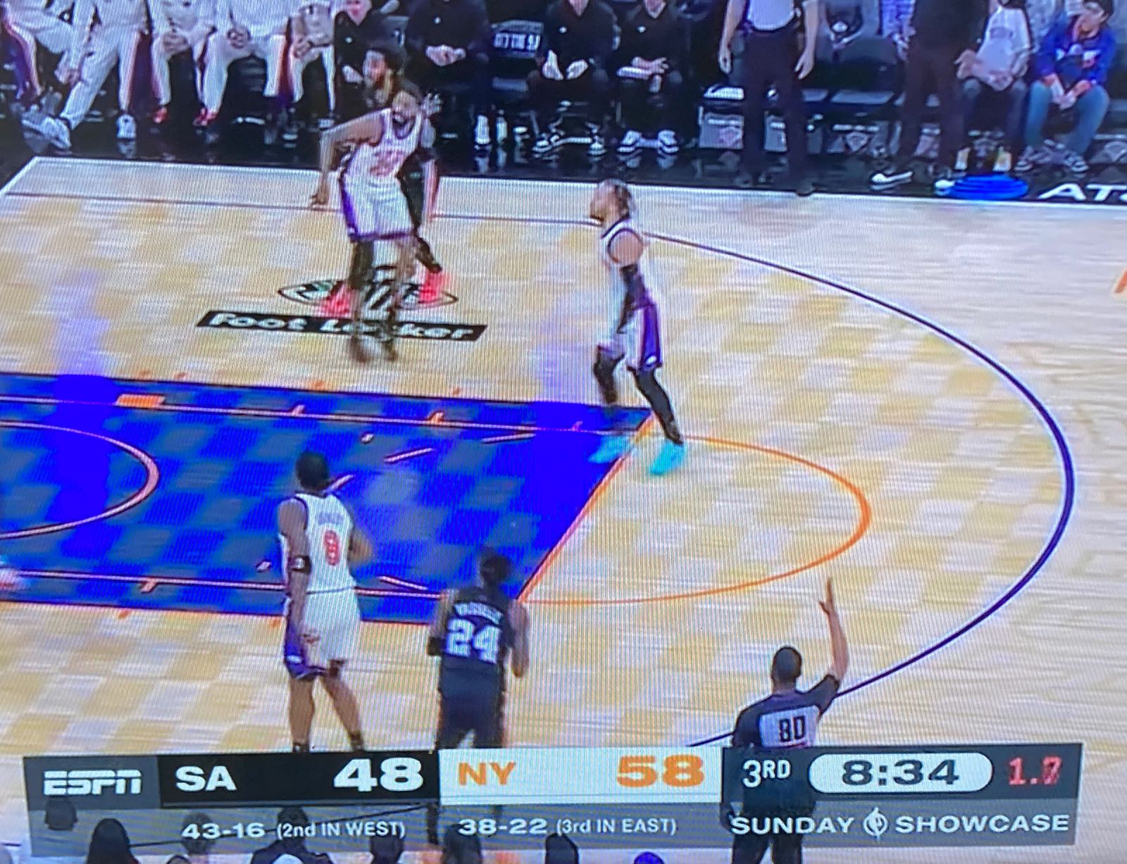
In this example, the teams and scores are shown in the same colors as their uniforms. San Antonio are in black with white numbers. New York are in white with orange numbers. And the same colors are used in the graphic. Boom.
Because the uniforms have to be designed with good contrast between the number and jersey, the graphic inherits this property. The Nicks uniforms use a darker richer orange that provides even better contrast than the graphic.
This is a good general solution because it makes the link between the team and scores clear and strong, shows the numbers in high contrast, and it’s clear what colors each team is wearing.
And for my money, dropping the logos is a win. Most logos don’t read well at the small size they need to be on screen. The logos are huge in the Prime example and still don’t communicate clearly.
I first noticed this uniform-based solution watching the Premier League.
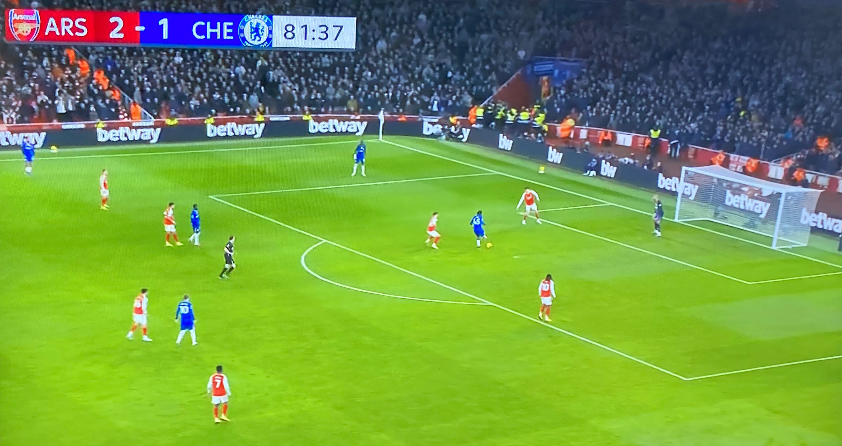
Here Arsenal (in red) are playing Chelsea (in blue).
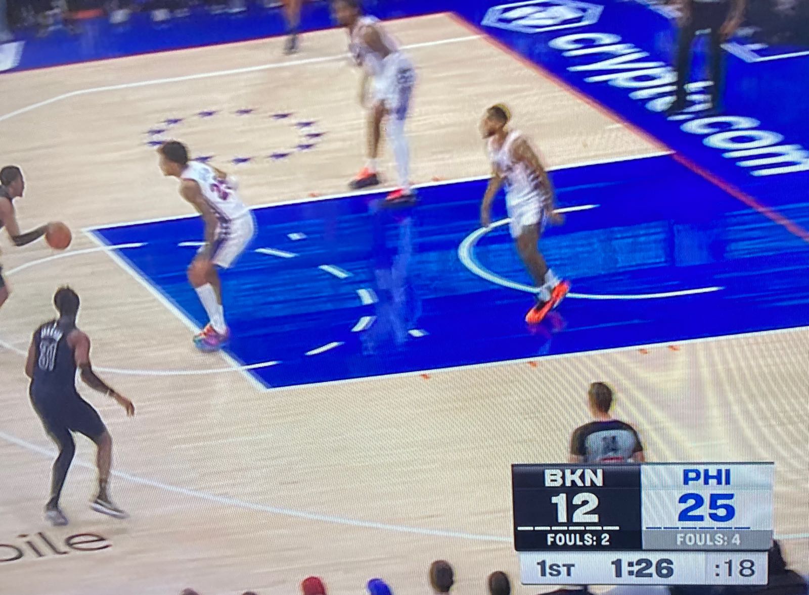
Many score bugs get this half right. Here’s an example from Altitude, the local network for the Nuggets.
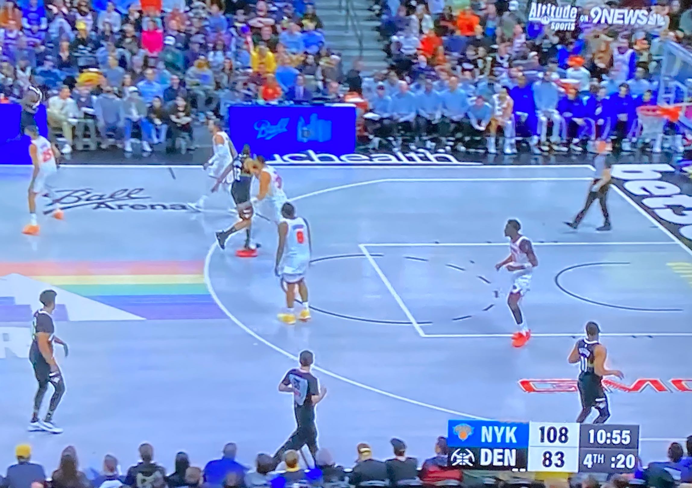
This graphic is half clear. The Nuggets are in black with white numbers, same as in the graphic. But you have to use the process of elimination to figure out that New York are in white. But at least this graphic uses the team colors, even if they ain’t wearing them tonight. And the 1-color Nuggets logo reads pretty well, but the Nicks logo is an orange smear.
Here’s another working example, again from Prime, but I think this is the NBA network’s graphics package.